


Dynamic Notch Notification Bar
4.71.40K Reviews
App Specs
- Version
- 6.3
- Updated On
- License
- Free
- Downloads
- 5,000,000+
- Developer
- Mahashivratri App
- Categories
- Productivity
- Platform
- Android
Screenshots
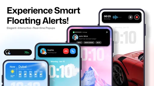
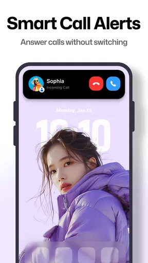
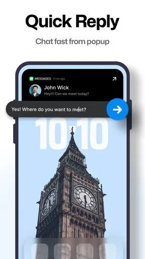
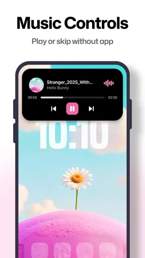
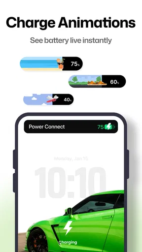
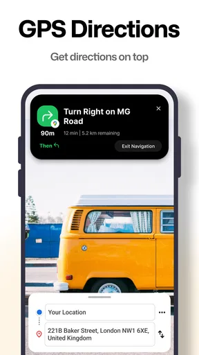
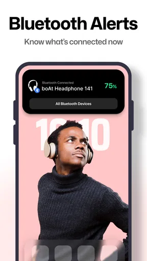
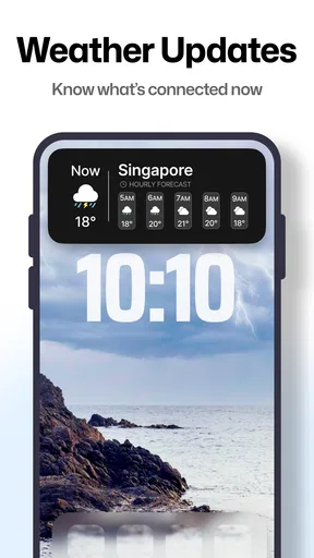
 Analysis by AppCompare
I tried Dynamic Notch Notification Bar as a small productivity utility rather than as a full notification manager. Its main idea is simple: it adds a dynamic notch-style bar to the phone and uses that area to present notification-related information in a more visible, modern-looking way. The appeal is immediate if you like the appearance of newer phones but use a device with a conventional status bar.
My first impression was that this is an appearance-and-awareness tool more than a deep productivity system. It can make incoming activity easier to notice at a glance, especially when the regular notification icons blend into the top edge of the screen. At the same time, the value depends heavily on whether you enjoy a persistent visual layer. If you prefer a completely clean interface, the same feature that makes the app interesting may feel unnecessary.
How the dynamic bar feels during everyday use
The developer, Mahashivratri App, positions this as a free productivity app, and that description makes sense when the bar helps me notice information without opening the notification shade every time. The experience is closer to a visual shortcut than to a separate workspace. I can still use the phone normally, while the notch-style element adds another place to look when something changes.
In normal use, the perceived speed is less about demanding computation and more about how quickly the visual element responds to activity. A lightweight overlay should feel immediate when it is working properly, but the exact impression can vary from one phone to another. Display behavior, system settings, and the way a device handles background activity all influence whether the bar appears consistently.
That is an important distinction. I would not install this expecting it to make the phone itself faster. It does not replace the notification system, improve app loading, or turn an older handset into a newer model. Its benefit is visual: it can reduce the small amount of attention needed to check what is happening at the top of the screen.
A practical example is a workday when I am switching between a document, a browser, and a messaging app. Instead of leaving the current screen to inspect every small notification icon, the dynamic bar gives me a more noticeable cue. I can decide whether something deserves an immediate response or whether it can wait. That saves a little friction, but the usefulness comes from repeated small moments rather than one dramatic feature.
What happens when the phone is busy
The most revealing situations are the heavy-use moments: several notifications arriving close together, a media app running, a game occupying the screen, or the phone moving between apps quickly. This is where a decorative overlay has to compete with everything else on the display. A bar that looks clear on a quiet home screen may feel more crowded over a bright video or a busy game interface.
Worth Reading Before You Choose

EA SPORTS FC Mobile 26 Is a Bigger Football Game, but It Takes Time

Flipboard Shows What News Apps Must Do Beyond the Feed

Switching to Android Auto Means Rethinking Your Driving Routine
Google Calendar Makes a Crowded Week Easier to Manage

Ludo King Makes the Most of the Minutes Between Plans

Baby Panda World Brings Quick Play to Modern Phones, but Its Game Library Feels Busy
I would treat the feature as a glance aid, not as a complete history of everything that arrived. When several events happen at once, visual notifications naturally become harder to interpret than a full notification shade. The bar may help me notice that something happened, but I still need the conventional notification area when the details matter.
This creates a useful trade-off. The dynamic bar is faster for a quick awareness check, while the standard shade remains better for sorting, reading, dismissing, or acting on multiple alerts. Trying to use the overlay as a replacement for the entire notification workflow would make the experience feel less efficient, not more.
There is also a distraction risk. A more visible notification cue can encourage me to look at the phone more often. For someone trying to reduce interruptions, the standard, quieter status bar may actually be the better choice. I found the app more suitable for people who miss notifications than for people who already feel overwhelmed by them.
Stability depends on the phone around it
Reliability is not only a question of whether the app opens. A notification bar needs to remain visually dependable while I move between screens, lock and unlock the phone, and use other apps. Android devices can handle overlays and background behavior differently, so a smooth experience on one handset may not feel identical on another.
The app supports devices running Android 8.0 or newer, which covers a broad range of phones. That is helpful for people who are not using the latest hardware, but compatibility at the operating-system level does not guarantee the same visual result everywhere. Screen cutouts, curved corners, display scaling, and manufacturer-specific interface rules can all affect how a notch-style element feels.
My advice is to judge it after using the phone normally for a while rather than during a quick glance. Check whether the bar remains comfortable over light and dark backgrounds, whether it interferes with controls near the top edge, and whether it still feels useful after the novelty fades. Those details matter more than the first attractive screenshot.
Recovery is another practical concern. If the bar stops appearing or behaves oddly, the sensible first steps are to reopen the app, review its in-app setup, and check the phone’s system treatment of background activity and overlays. I would not assume that every interruption means the app is broken; Android’s battery and display management can affect utilities that need to remain available while other apps are open.
Still, this is exactly the kind of app where recovery should be simple. If I have to repeatedly troubleshoot it just to see a notification accent, the convenience disappears. Its best version is one I can configure once and then mostly forget about until it provides a useful glance.
Battery, memory, and the cost of an always-visible idea
Dynamic visual elements naturally raise questions about resource demands. I would be cautious about promising a particular battery impact because the result depends on how the phone renders the bar, how often it reacts, and how aggressively the system manages the app. On a recent device, the practical cost may feel insignificant; on an older or heavily loaded phone, every background utility deserves more scrutiny.
The same applies to memory. This should not be confused with a large game or an editing suite, but a utility that stays ready for notification activity is still another layer in the phone’s software environment. If the handset already struggles with multitasking, I would watch for signs such as apps reloading more often or the interface feeling less comfortable during long sessions.
A useful test is to use the phone through a normal day with the feature enabled, then compare how it feels with the feature disabled. I would pay attention to battery percentage at similar times, app switching, heat, and whether the phone becomes more eager to close background apps. That personal comparison is more meaningful than assuming every Android device will behave the same way.
For most people, the question is not whether the app uses absolutely nothing. The better question is whether the visual benefit justifies another active interface element. If I frequently miss alerts, the trade-off can be reasonable. If I rarely look at notifications and care strongly about battery simplicity, it is harder to justify.
Device shape and software settings matter
The word “notch” can suggest a precise hardware match, but this app is better understood as a software-styled notch bar. It is not the same as having a physical cutout designed into the screen. That means expectations should stay realistic: the effect can imitate a modern top-center or top-edge treatment, but it cannot change the phone’s actual display hardware.
Phones with different aspect ratios, punch-hole cameras, curved edges, or unusually thick status areas may produce different visual impressions. A placement that looks balanced on one screen can seem too low, too high, or slightly crowded on another. Display scaling also matters. Users who enlarge system text or interface elements may find that the available space feels tighter.
I would also consider how the bar interacts with apps that already place buttons or information near the top. Reading, browsing, and messaging are usually forgiving because their layouts leave some breathing room. Full-screen games, video players, camera apps, and tools with edge controls are less predictable. In those situations, the overlay may be less helpful simply because the underlying app needs the same visual territory.
This is one reason I would not recommend it equally to everyone. It suits someone who wants a modern notification accent on a conventional Android phone and is willing to accept a little visual compromise. It is less suitable for someone who uses many full-screen apps, needs every pixel for work, or dislikes anything floating above the current interface.
Where it fits beside ordinary alternatives
The usual alternative is the built-in notification shade and status bar, and those remain more powerful. They offer a familiar place to inspect details, manage alerts, and access quick settings. They also require no additional visual layer, which makes them the safer option for users who value simplicity and predictable system behavior.
Another alternative is a launcher or theme that changes the overall appearance of the phone. That approach can create a broader visual redesign, but it may also alter icons, home-screen behavior, and navigation habits. Dynamic Notch Notification Bar is narrower in purpose: it focuses attention on the top area instead of asking me to rebuild the entire interface.
That narrower approach is its strongest distinction. I do not need to commit to a complete theme just to experiment with a notch-style notification presentation. On the other hand, users looking for detailed notification automation, advanced filtering, or a full customization system may find it too limited compared with dedicated tools in those areas.
The app is free to install, which makes trying it relatively low-risk. It also carries an Everyone content rating, so its presentation is intended for a broad audience. Optional purchases range from $2.99 to $104.99 per item, so I would inspect the purchase screen carefully before paying and decide whether the extra customization is genuinely useful to me rather than buying simply because the visual effect is new.
Its popularity suggests that the concept has reached a substantial audience: it has passed five million installs, with an average rating of 4.6 from around two hundred and twenty thousand ratings. Those figures make it more reassuring to try than an obscure utility, but they do not remove the need to check how it behaves on a particular phone. A high rating can reflect enjoyment of the look, while individual device compatibility still varies.
Who will get the most from it
I think the best audience is someone using an Android phone without a built-in dynamic island-style interface who wants a more noticeable way to catch notifications. It can also appeal to people who enjoy customizing the phone’s appearance but do not want to install a full launcher or replace the entire home-screen experience.
It is particularly practical for a person who often keeps the phone on silent or vibrate and misses small status icons. In that situation, a more visible top-bar cue can act as a gentle reminder to check the notification shade. It may also help users who prefer visual confirmation over repeatedly pulling down the shade just to see whether anything new arrived.
I would skip it if the phone already has a notification design that I like, if top-screen space is important, or if I am trying to minimize background utilities. I would also be cautious if I spend most of my time in full-screen games or video apps. The app’s central idea is visual presence, and that is exactly what some users will experience as clutter.
People concerned about privacy should also think about the practical visibility of notifications. A notification shown more prominently at the top of the screen may be easier for the owner to notice, but it may also be easier for someone nearby to see. I would avoid displaying sensitive message previews in a public setting and use the phone’s broader notification controls to limit what appears visibly.
Version, setup expectations, and long-term value
The current version is 6.3, and the app was released on September 27, 2022. That history gives the project time to mature beyond a one-week novelty, but long-term value still depends on whether the bar becomes part of my routine. A visual effect can be exciting on the first day and irrelevant by the end of the week.
To make the trial meaningful, I would use it during several different routines: quiet reading, rapid messaging, media playback, and a period with many incoming notifications. I would also test it after locking the phone, reopening frequently used apps, and switching between portrait and landscape where appropriate. The goal is not to force the feature into every situation, but to learn where it genuinely saves attention.
One non-obvious tip is to treat the bar as a triage signal. I would not try to read every alert from it. Instead, I would use its appearance as a prompt to decide whether to open the notification shade immediately, finish the current task, or ignore the event. That keeps the overlay from becoming another stream of information competing for attention.
A second useful approach is to compare it with the phone’s default arrangement before changing anything else. If I install a launcher, theme, and notification utility at the same time, I cannot tell which layer creates a problem. Testing this app by itself makes it easier to identify whether the notch presentation is comfortable, distracting, or affected by the device’s own interface.
A third trade-off is visual consistency. The bar may look excellent in the home screen and ordinary apps but less natural when the underlying screen changes color or enters full-screen mode. I would choose it for the moments where it improves awareness, not because I expect it to blend perfectly into every app on the phone.
My performance verdict
After weighing the idea against its limitations, I see Dynamic Notch Notification Bar as a focused customization utility with a clear purpose. Its perceived speed should be judged by how quickly it helps me notice activity, not by expecting improvements to the phone’s overall performance. When the visual cue is available at the right moment, it can make notification checking feel quicker and more deliberate.
Its stability and resource profile are more device-dependent than the simple concept suggests. Android version support is broad, but screen design, manufacturer software, background management, and app layout all influence the final experience. I would give it a fair trial on the actual phone I plan to use rather than relying only on how the feature looks in promotional images.
The app is not a replacement for the notification shade, a battery optimizer, or a full customization suite. It is best when I want one noticeable visual enhancement and accept that it may be less comfortable in full-screen or information-heavy situations. The free entry point makes experimentation easy, while the optional purchase range means I would stay selective about paying for additions.
My recommendation is positive for users who enjoy modern interface touches, miss notifications, or want a software version of a dynamic notch without changing launchers. I would recommend skipping it for anyone who values a minimal screen, already has excellent system notification tools, or is especially sensitive to background utilities. The deciding question is simple: does a more visible notification cue save you attention, or does it create another thing to watch?
For me, that makes it a worthwhile try rather than an essential installation. The concept is specific, easy to understand, and potentially useful in everyday notification triage. Its success depends less on impressive specifications than on whether the bar remains comfortable, stable, and unobtrusive on my particular device. If it passes that personal test, it adds a pleasant modern touch; if not, the standard Android notification shade remains the cleaner and more dependable choice.
Pros
- Keeps key alerts visible without opening the full notification panel.
- Offers a more interactive look than the standard Android status bar.
- Can be customized to match different wallpapers and personal styles.
- Useful for checking notifications discreetly while using other apps.
- Lightweight design generally has little impact on everyday phone use.
Cons
- Requires sensitive notification and accessibility permissions to work fully.
- Some features may not work correctly on phones with camera cutouts.
- Persistent overlays can occasionally interfere with buttons or screen content.
- Customization options may vary depending on the Android version and device.
- The free version may include ads or limit advanced visual effects.
FAQs for Dynamic Notch Notification Bar
What is Dynamic Notch Notification Bar and how does it work?
Dynamic Notch Notification Bar is an Android customization app that places interactive notification controls around the phone’s camera cutout or notch area. After granting the required permissions, it can display incoming alerts, music controls, battery information, and selected shortcuts in a compact floating interface. Its exact appearance and available features may vary depending on your device model, Android version, and screen layout.
What permissions does Dynamic Notch Notification Bar require?
The app may request access to notifications, accessibility services, display-over-other-apps permission, and battery-related information so it can show alerts and interactive controls above other applications. These permissions are important for the main experience, but users should review each request carefully before enabling it. Only grant access that you understand and feel comfortable using, and disable permissions whenever you no longer need the app.
Is Dynamic Notch Notification Bar compatible with every Android phone?
The application can work on many Android smartphones, including models with a centered punch-hole camera, a traditional notch, or certain full-screen designs. However, compatibility is not identical across all devices. Camera placement, screen resolution, manufacturer software, gesture navigation, and system restrictions can affect alignment and behavior. Before downloading, check the app’s current requirements and test its positioning settings on your specific phone.
Can I customize the appearance and behavior of the notification bar?
In most cases, Dynamic Notch Notification Bar offers settings for adjusting the overlay’s position, size, color, animation, corner shape, and the types of notifications or controls it displays. You may also be able to select preferred music actions and notification categories. Customization options can differ by version, and some advanced styles or features may be limited by advertisements, device compatibility, or premium upgrades.
Does Dynamic Notch Notification Bar affect battery life, privacy, or phone performance?
Because the app monitors notifications and maintains an overlay service, it may use a small amount of additional battery and system resources, especially when animations are enabled. Privacy depends on the permissions you grant and how notifications are handled by the app; sensitive message previews could appear on screen. Review privacy settings, hide confidential content, and disable the service if you notice excessive battery use or performance changes.


